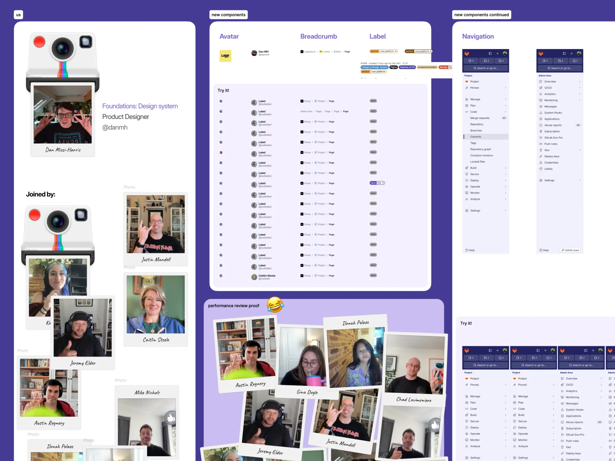
I am Dan Mizzi-Harris.

I design, I make, I fix and I tinker.

Always finding patterns. Happiest helping others do their best work.

Most recently Senior Product Designer, Design System @ GitLab

It changed me, read about it on danmh.xyz

About

A design generalist,
with the skills to build.


A technical designer. Best tidying up the messy middle. Saving people time, money, and energy by closing the gap between canvas and code.

I've worked on complex tools and technical products. I've maintained enterprise design systems and started smaller ones. I've not stopped being curious. I started by dragging files over ftp to prod, I now have opinions about terminal emulation. I want to do something meaningful with great people united by a shared mission and values.

Although my recent experience is specialised, I am a proud design generalist. With rock solid graphic design roots — and a dark past of both agency and freelance — I've done enough of everything to be helpful (and sometimes a bit dangerous).


See some of my work or take a look at my experience

Work

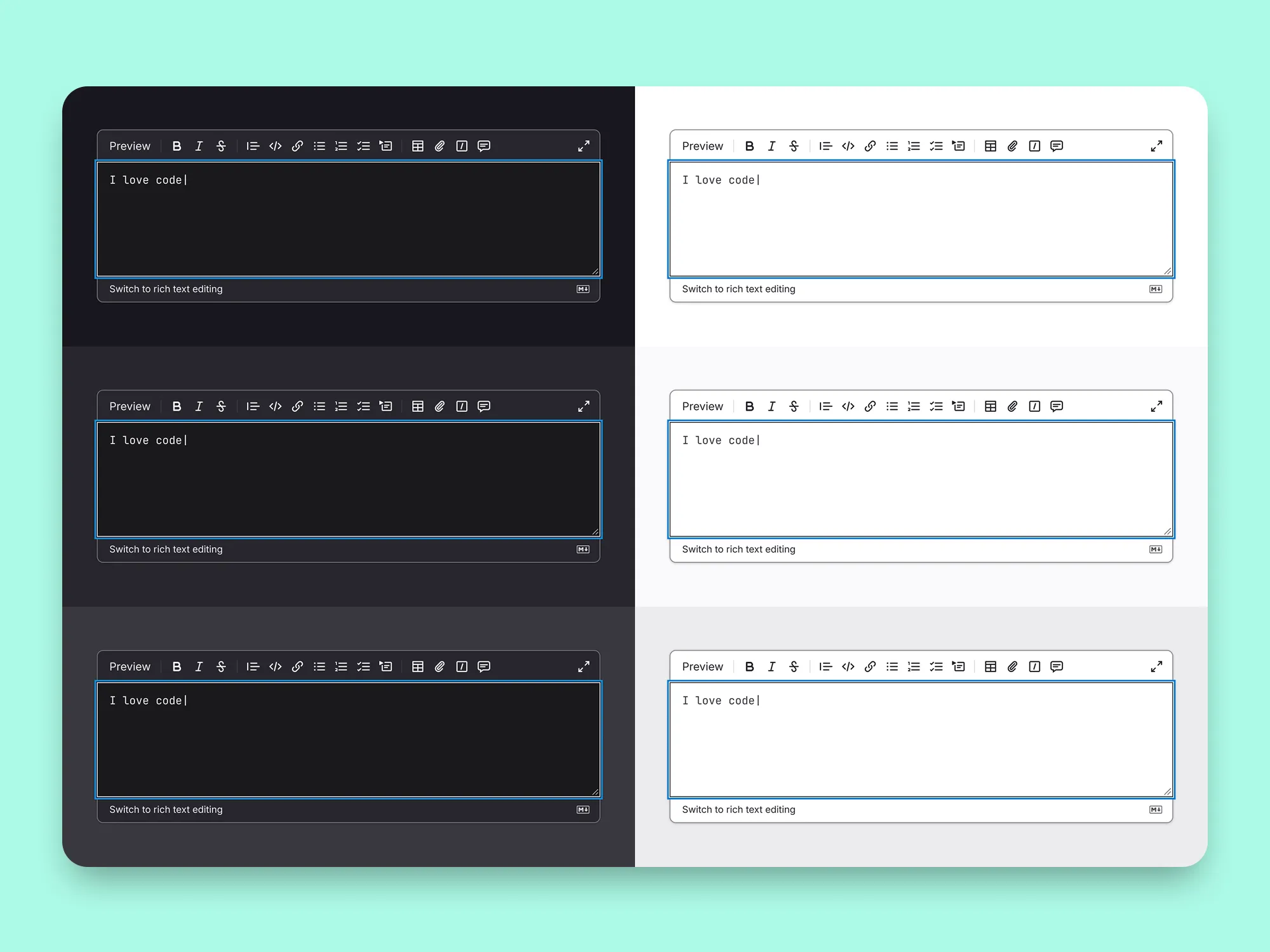
Design tokens 1
Design tokens 2
Design tokens 3
Design tokens 4
Design tokens 5
Design tokens 6

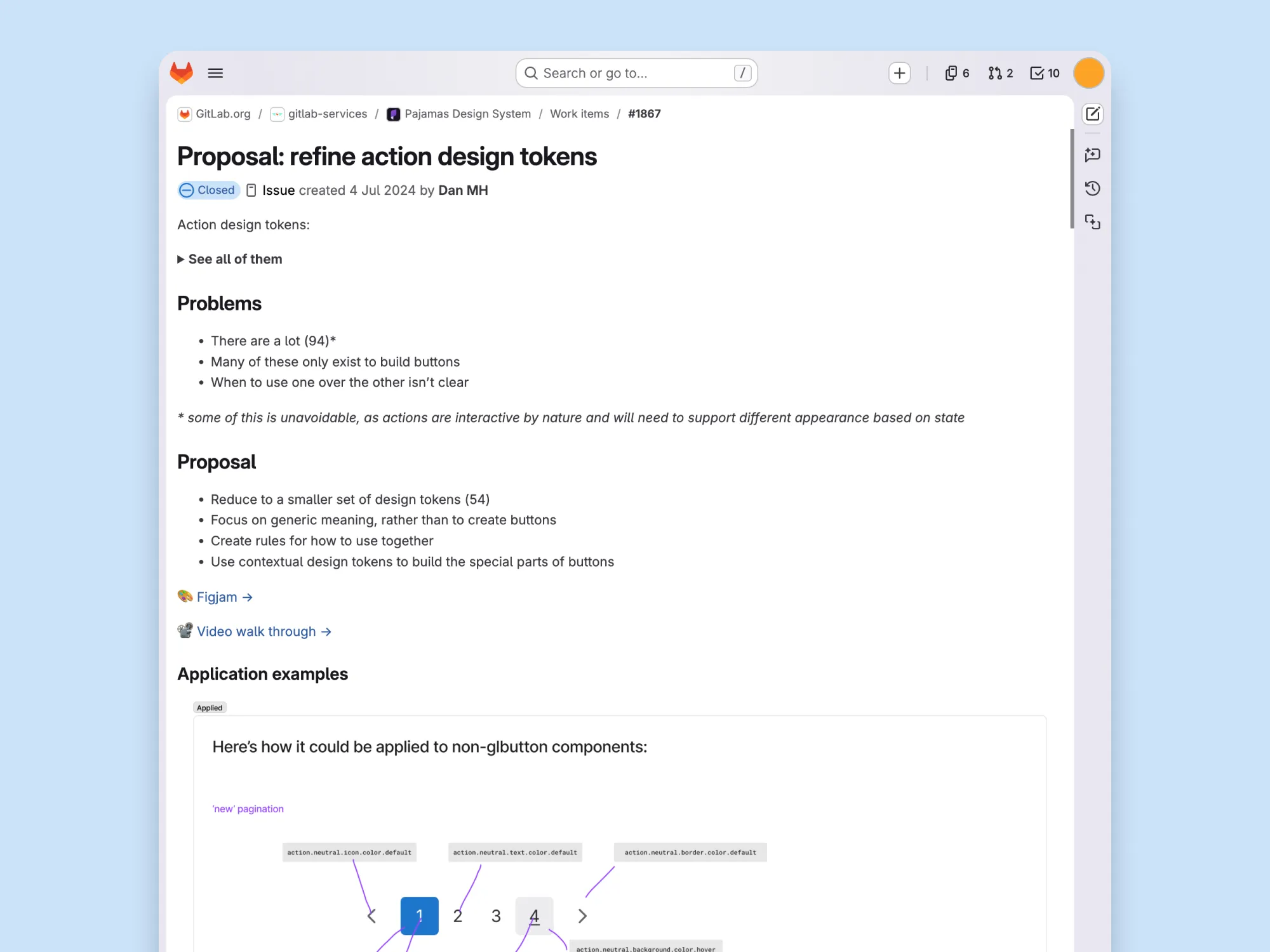
Design tokens

Driving the transformation of teeny tiny key:value pairs into the design system powerhouse.

*slaps roof of car* this bad boy can fit so many design decisions in it.

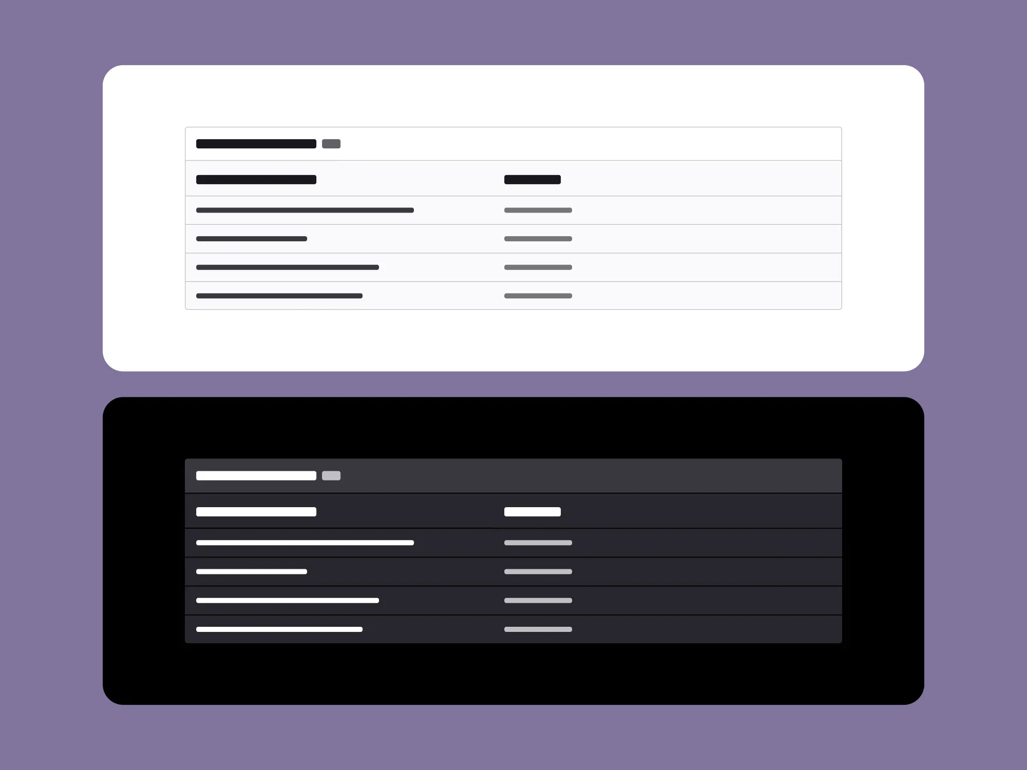
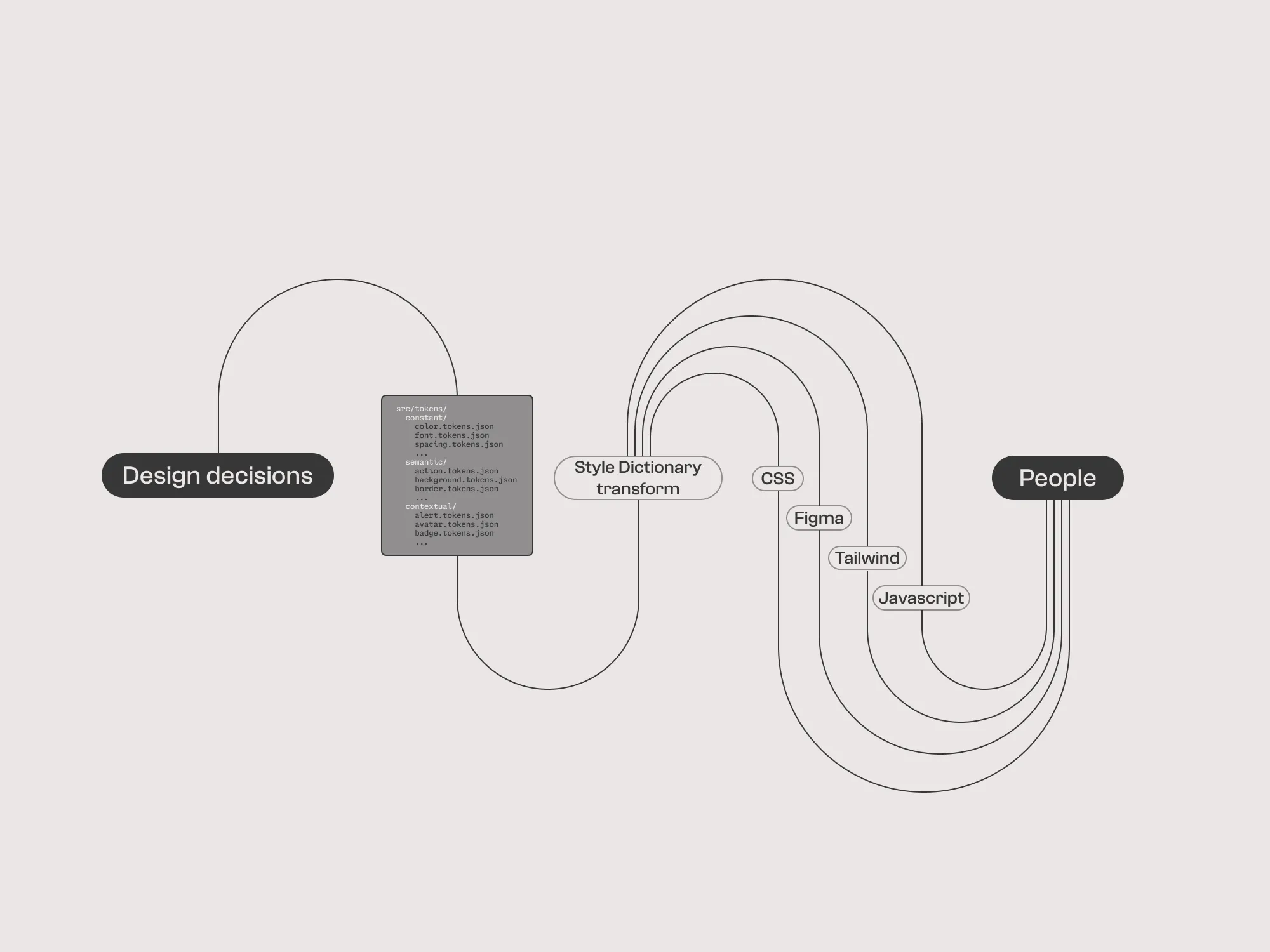
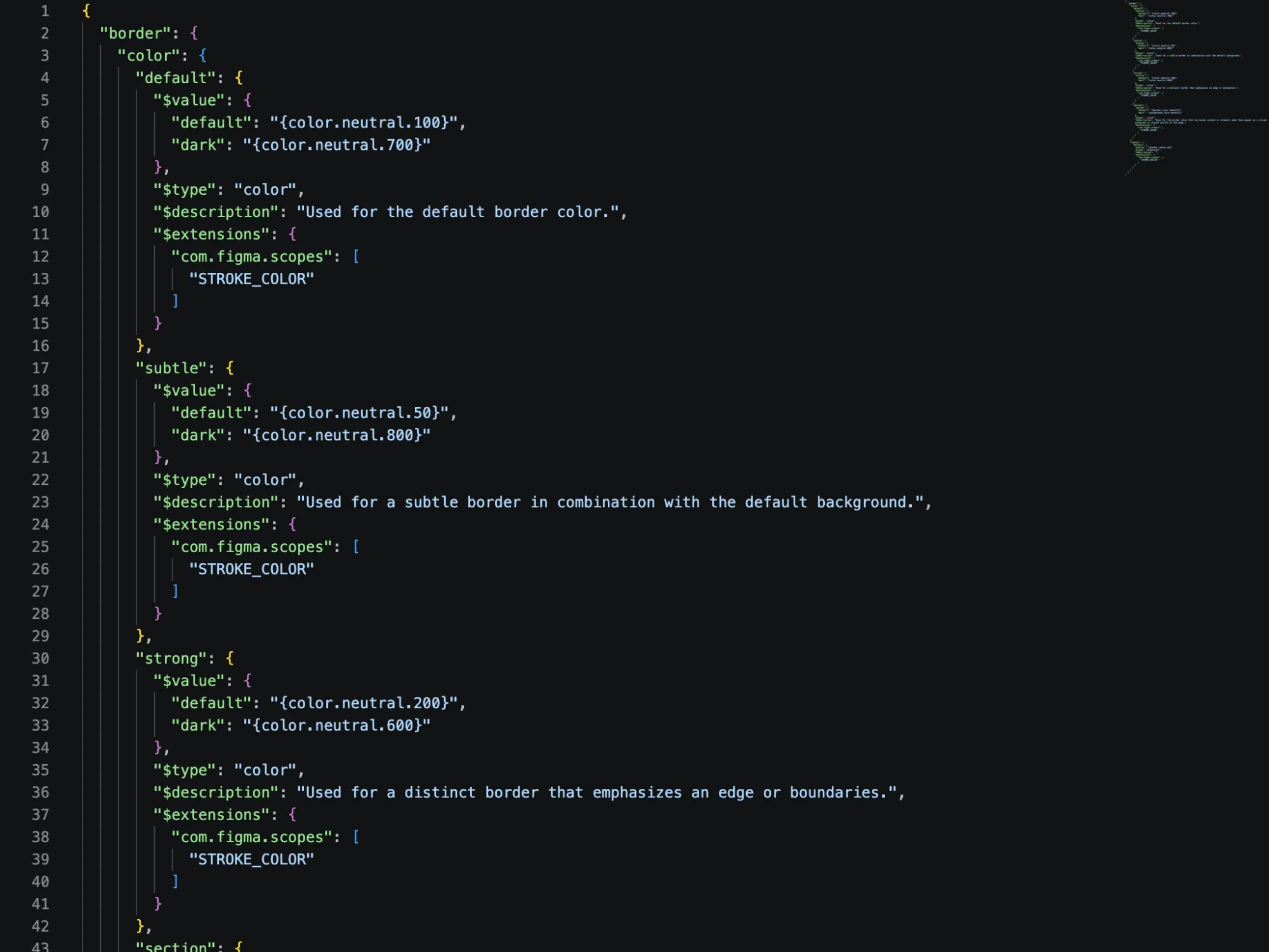
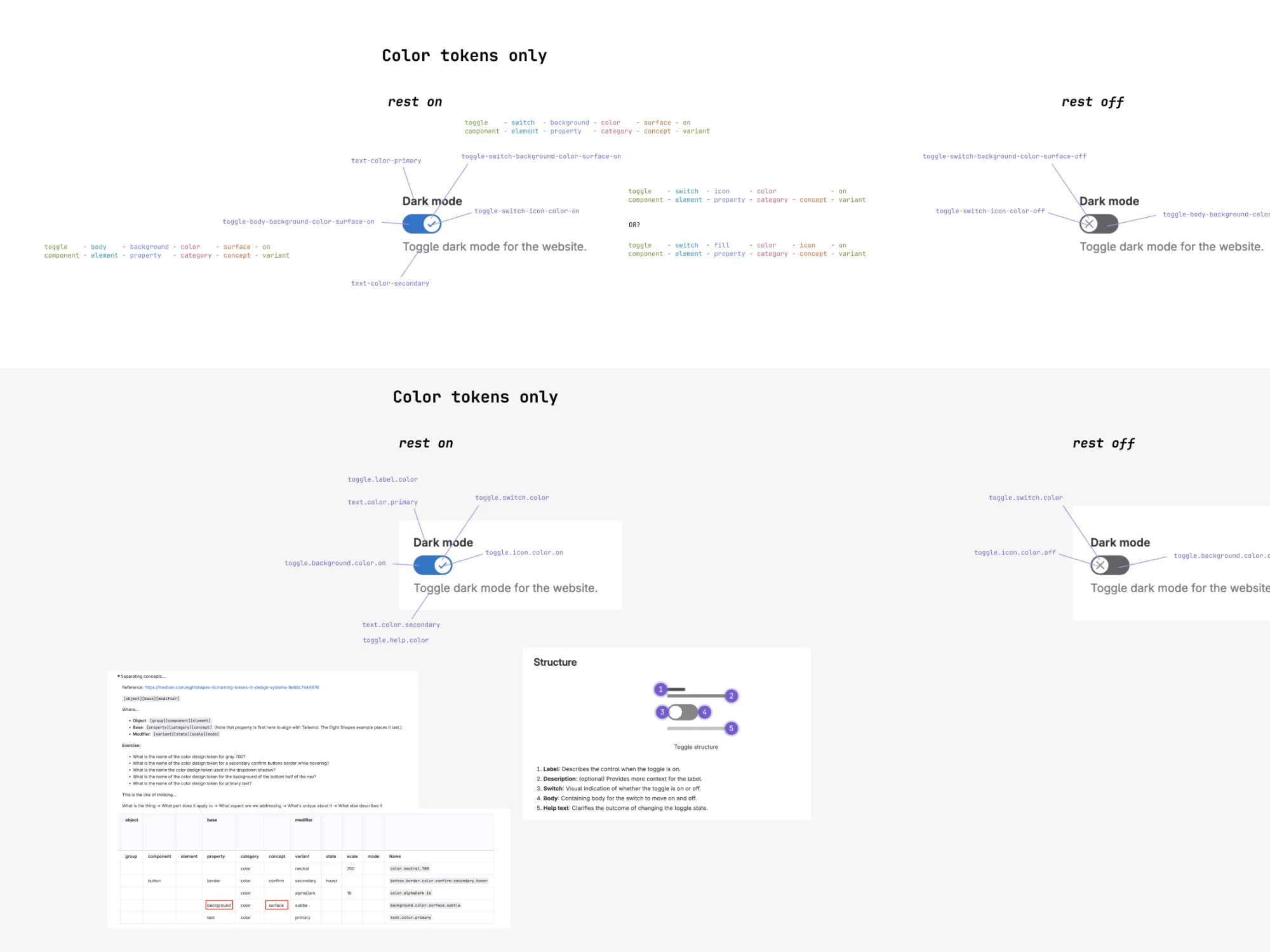
Today we use our single design token system to build ~1,100 design tokens from ~60 DTCG-format source files for 6 destinations, with theme-aware colours emitted in both light and dark variants. From here they flow everywhere: Tailwind config, CSS custom properties and SCSS variables for our stylesheets, typed JS constants for runtime theming, and a programmatic push to Figma Variables via the REST API.

At GitLab we had three problems we were trying to solve: 1. Make designer and developer handover more efficient; 2. Speed up feature design, validation, and review, by providing easy to understand and use ‘micro decisions’; 3. Prepare the way to enable high impact product features (like dark mode), without requiring feature teams to do twice as much work.

∆ Ok there were more than three problems total, but let’s keep this about design tokens.

As a team, we bet on tanuki-flavoured design tokens as a way to address these three things.

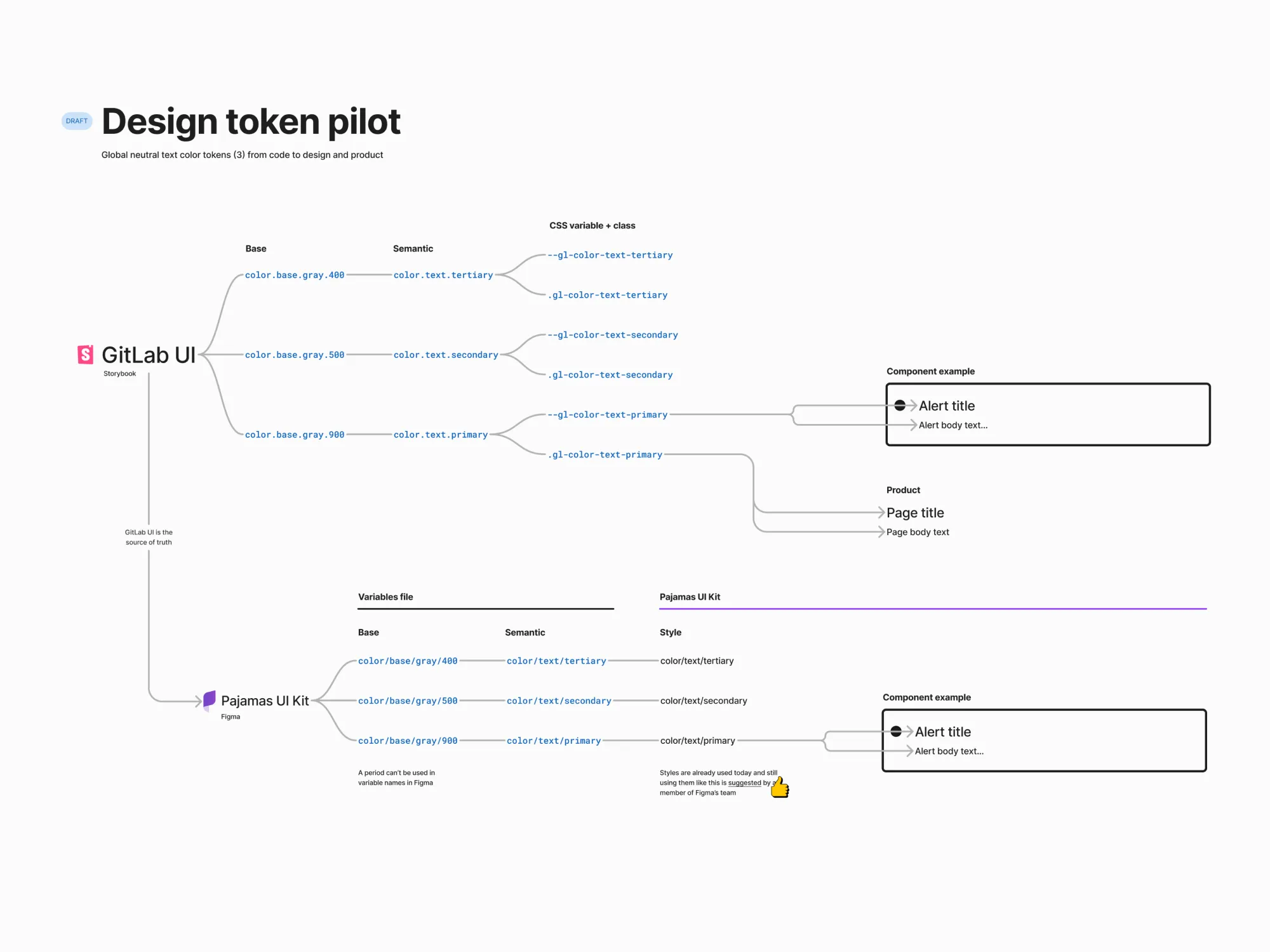
I’m most proud of the impact on colleagues through the design token pilot I proposed and ran. I conducted designer research interviews, authored implementation proposals, and reviewed numerous merge requests for token implementation.

The pilot reduced risk and validated approaches early, I identified and implemented mechanisms to only expose the variables designers need in Figma and I built an internal plugin to reveal the variable descriptions to support use (until Figma sherlocked it).

Using these learnings I led the successful implementation of design tokens across the design system components. I also shaped some interesting GitLab-specific details, such as the ‘tier’ naming constant, semantic, and contextual; heavy contextual design token use for Vue and Figma syncing; and code-first workflows for token authoring.

Dark mode was unlocked. Micro decisions available. Still more work to do to improve designer and developer handover.
Dark mode 1
Dark mode 2
Dark mode 3
Dark mode 4
Dark mode 5
Dark mode 6

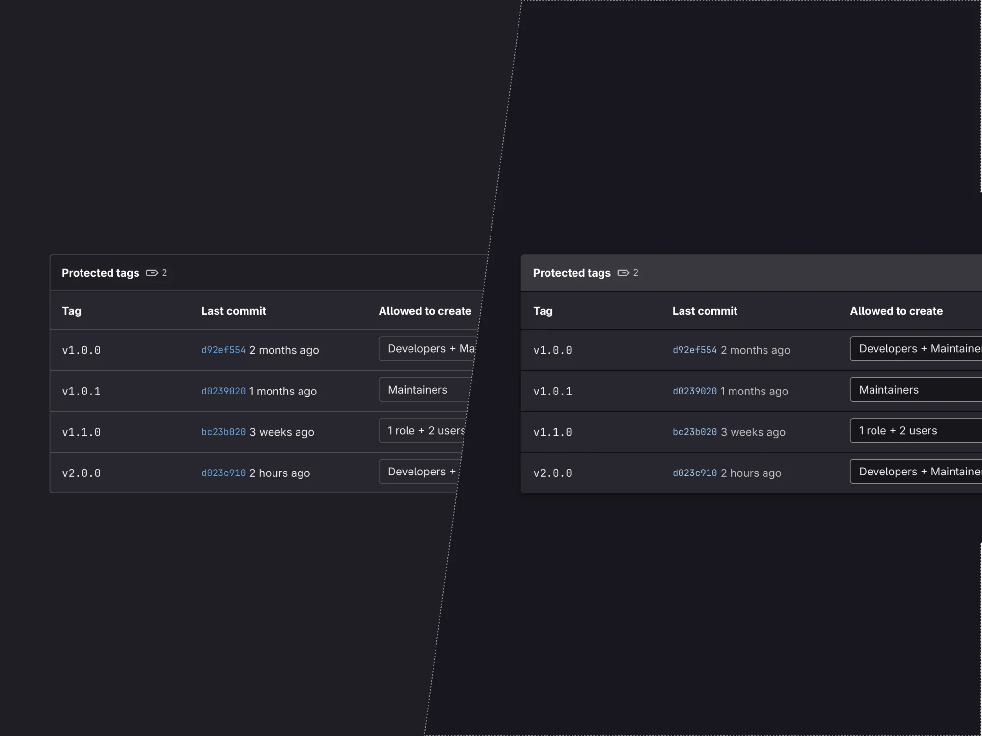
Dark mode

Creating the mechanisms, rules, and patterns to enable designers and engineers to build our dark mode vision.

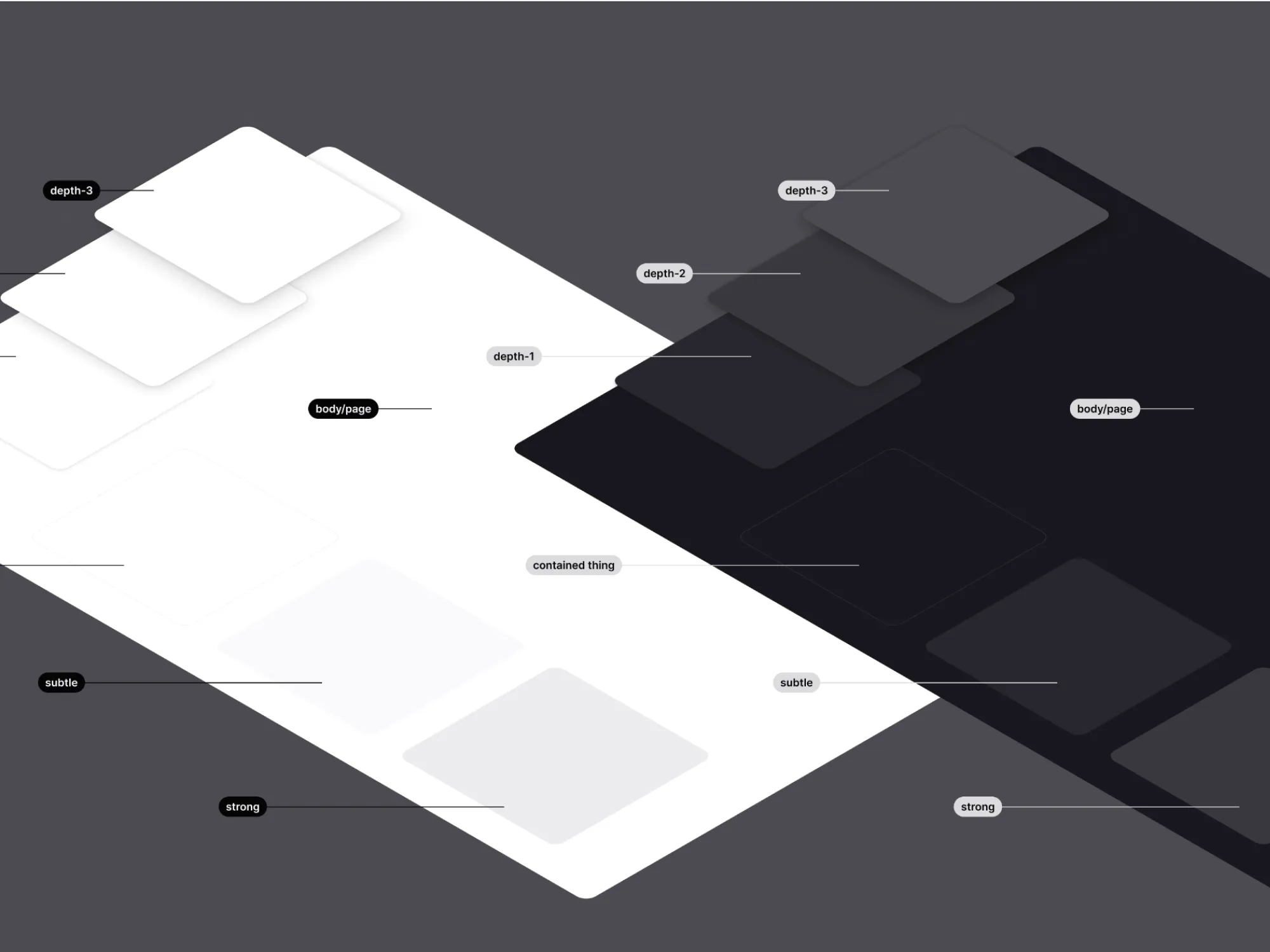
“AH MY EYES!” is probably what you would have said if you switched from your dark IDE to 2020’s light-mode-only-GitLab. The most upvoted issue ever did receive temporary relief when a small dedicated group implemented an algorithmic inversion of all the colours. I brought the vision to life, crafting the rules, patterns, and mechanisms to make it real. Taking an inversion to a full set of dark construction materials to build the interface.

Our hopes were straightforward: 1) take the unrefined invert-the-ui experimental dark mode capability and make something loveable GA. 2) it must not double the workload for designers and developers — make something that justworks™ so our colleagues didn’t have to build once dark mode and then again in light mode.

The hardest thing about dark mode is everyone thinks it is easy.

Together we built the plane while flying it. Jeremy, Sascha, and co laid out a fantastic vision for what our dark mode could be. In parallel, I curated the patterns emerging from that work, figuring out how to scale the decisions from a handful of crafted screens to the whole platform.

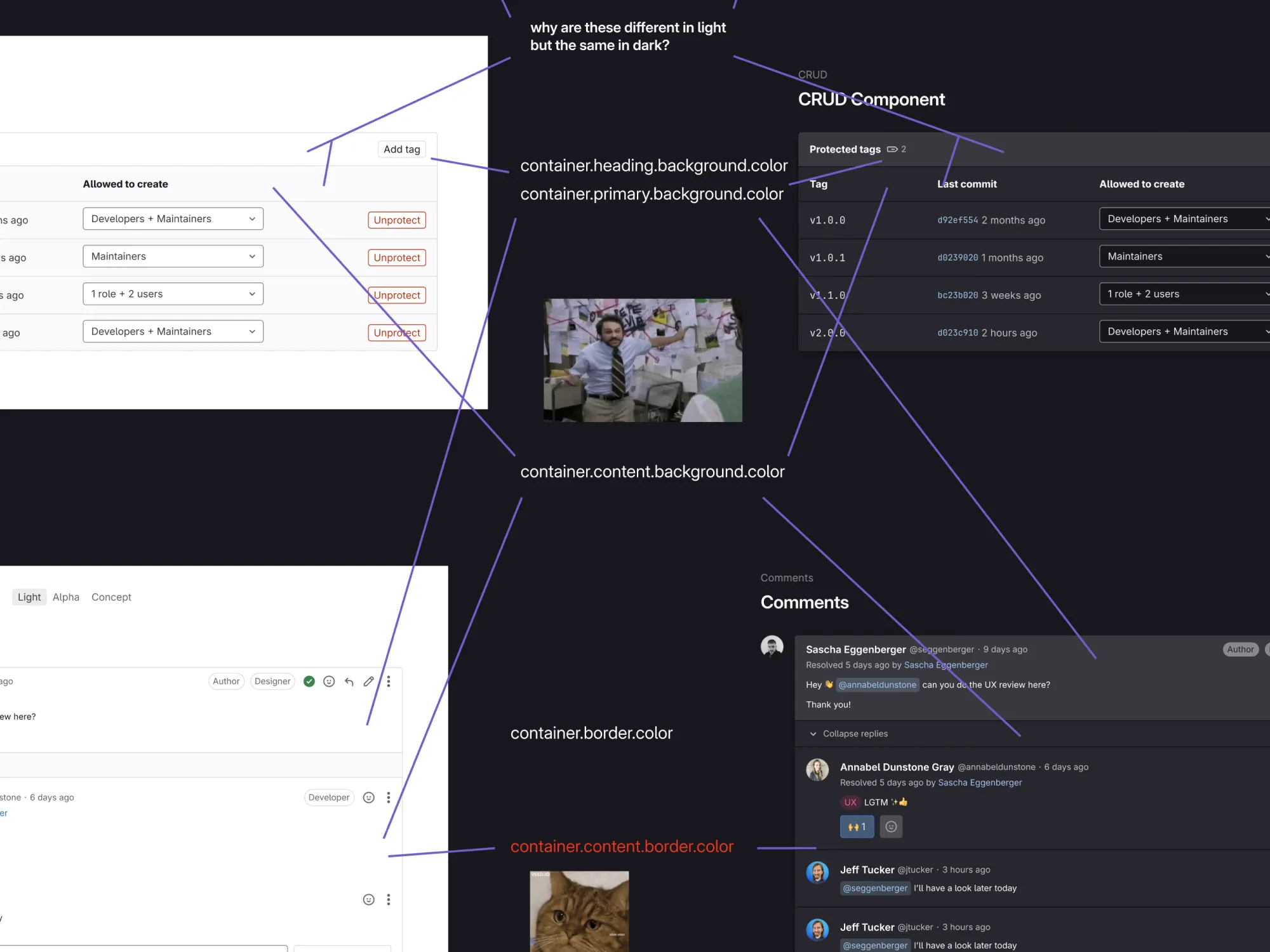
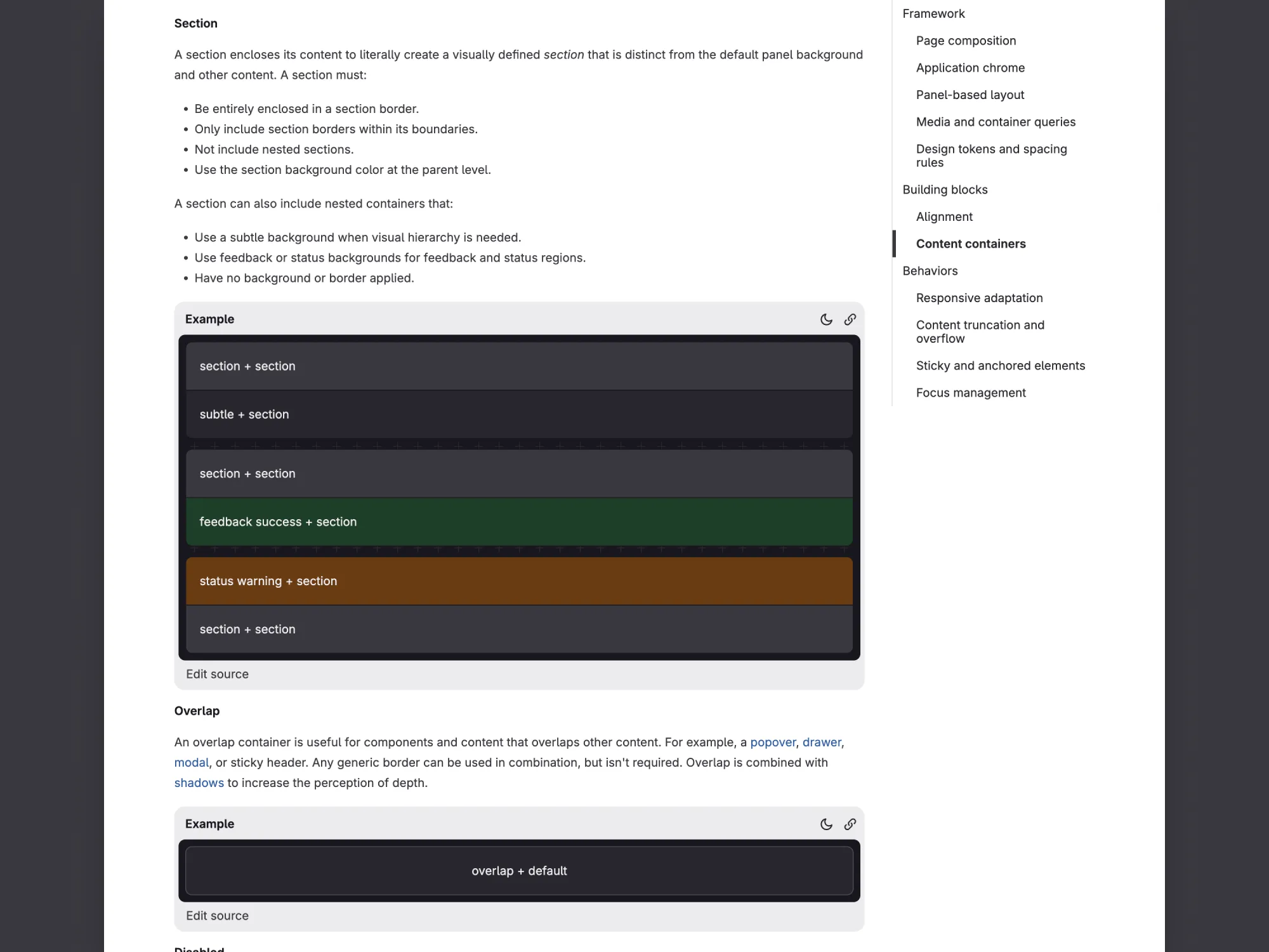
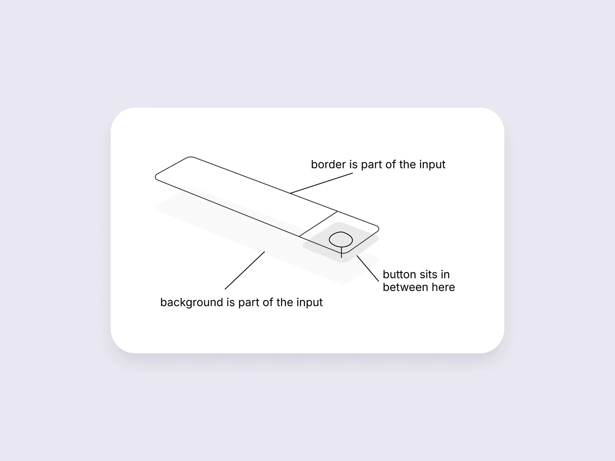
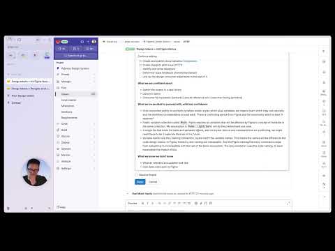
My most complex and impactful contribution was creating background and surface definitions with real semantic meaning — most ‘how to design token’ resources handwave this away, it is hard. I created a new paradigm to solve it: section. In light mode it used visible borders, in dark mode it used a background colour change with a ‘knockout’ effect for borders.

GitLab is massive, monolithic, and layered — a messy stack of partial migrations and mixed approaches. Implementing this meant updating definitions last touched up to 10 years prior. Around 20,000 colour call sites would be affected. I identified and implemented a CSS escape hatch for consumers to implement their own colours that need to change across mode without every colour use needing to be defined and maintained in the design system.

I coordinated the design system rollout to 40+ Figma and Vue components. I designed and built our Figma approaches to work with dark mode and achieved a zero-downtime release.

Sentiment research 1
Sentiment research 2
Sentiment research 3
Sentiment research 4
Sentiment research 5
Sentiment research 6

Sentiment research

Uncovering and addressing critical design system usability and contribution challenges.

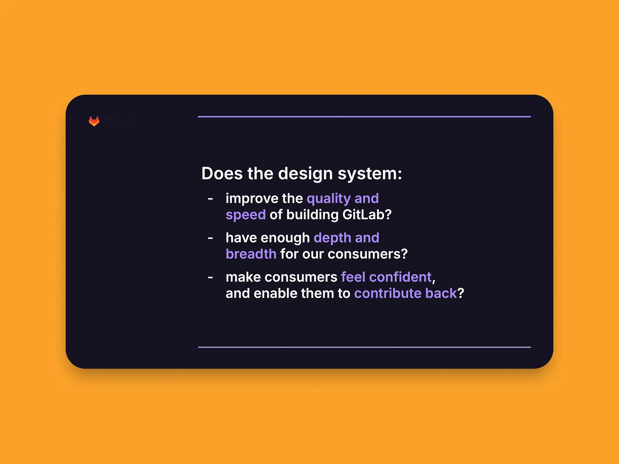
“Does the design system work?”

Not a question that could be answered confidently when I joined the design systems team — but a question I needed to know the answer to.

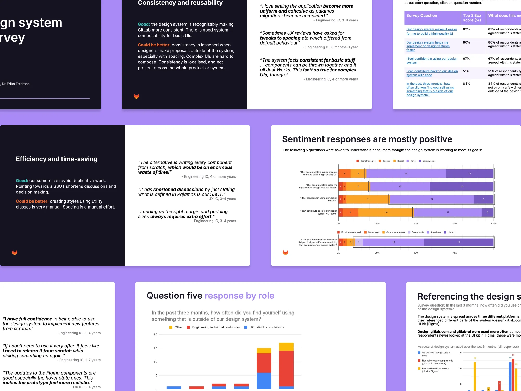
In collaboration with UXR I designed and led recurring company-wide research on the effectiveness of the design system, documenting opportunities, and implementing solutions.

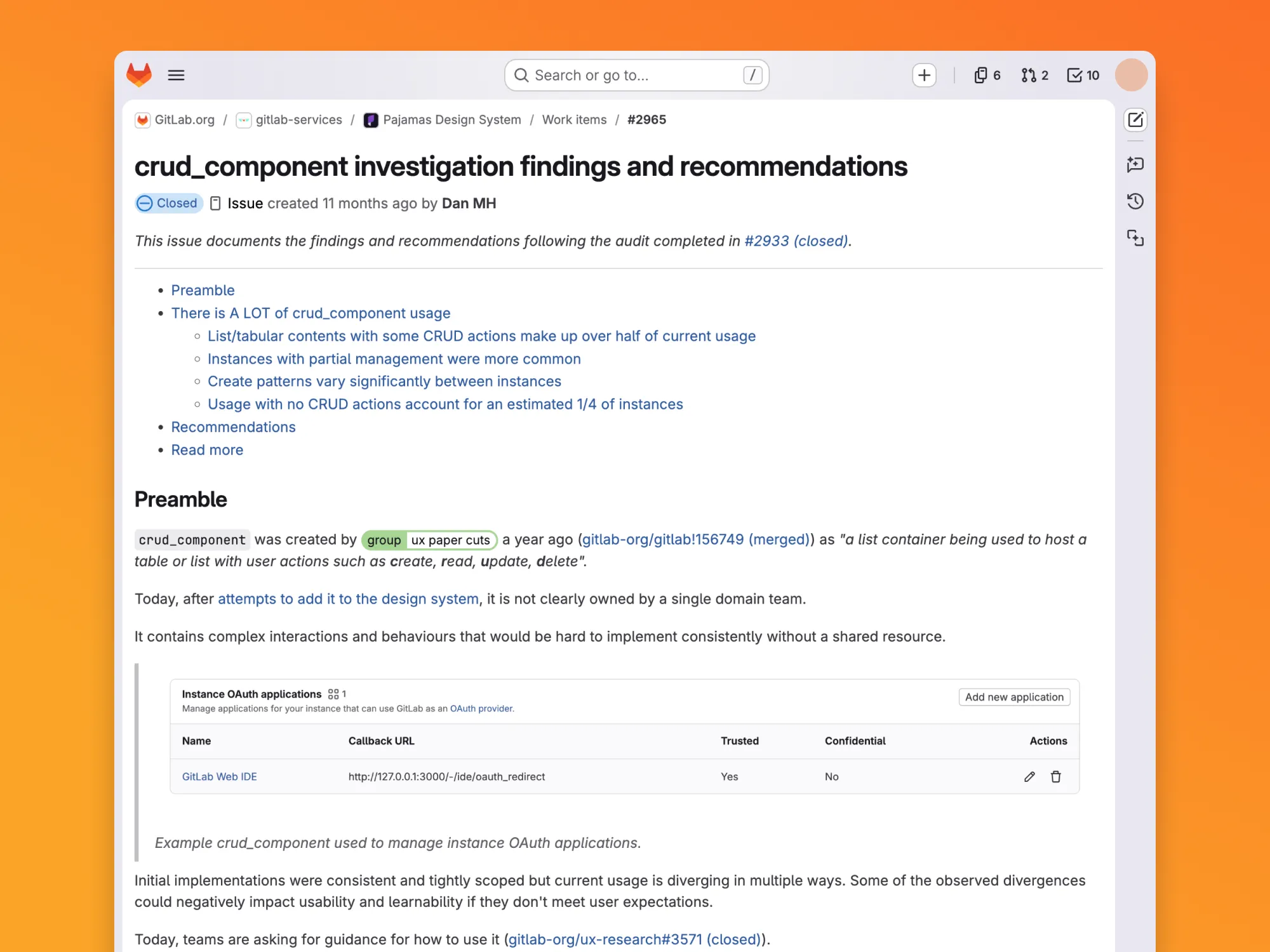
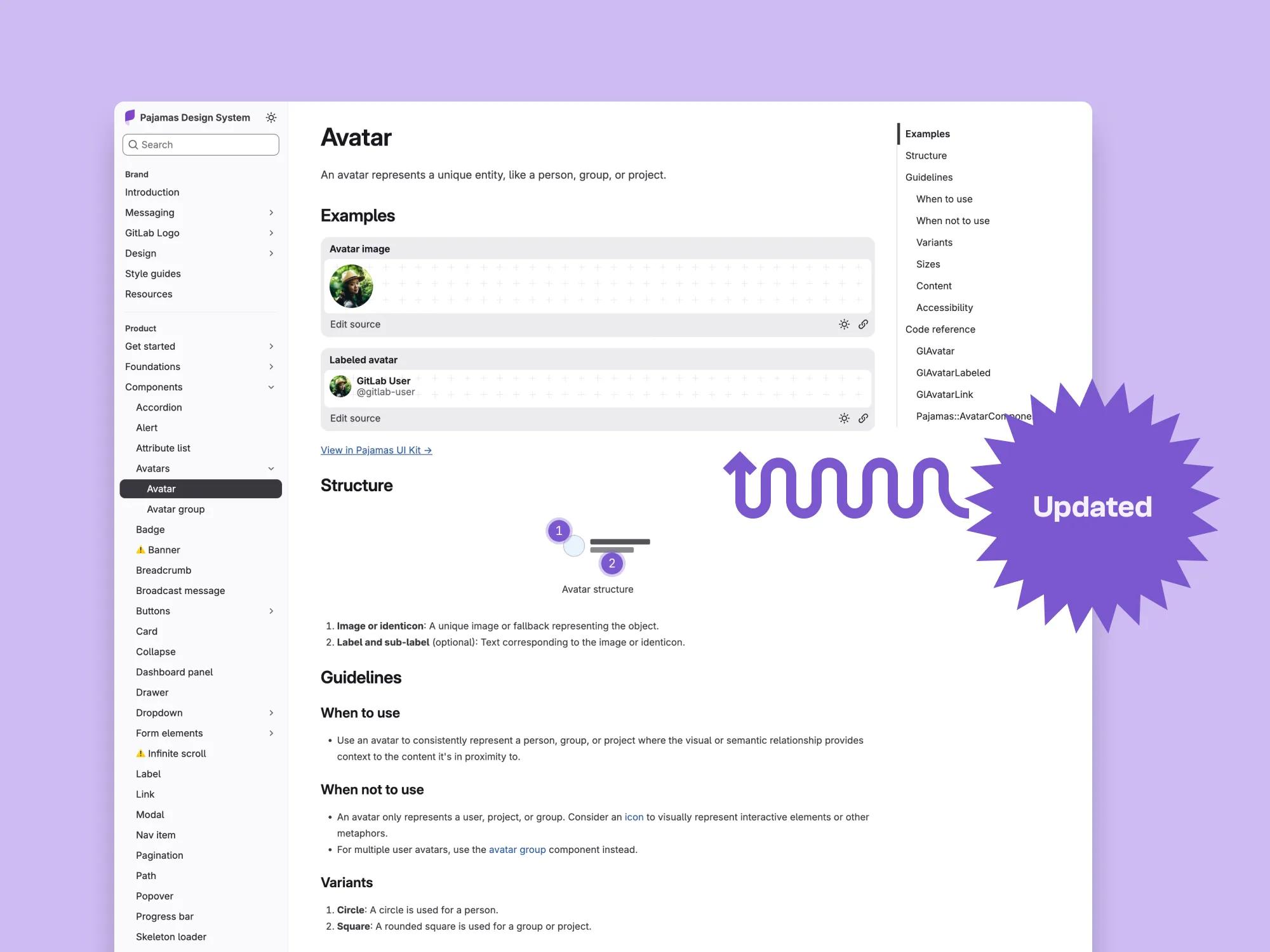
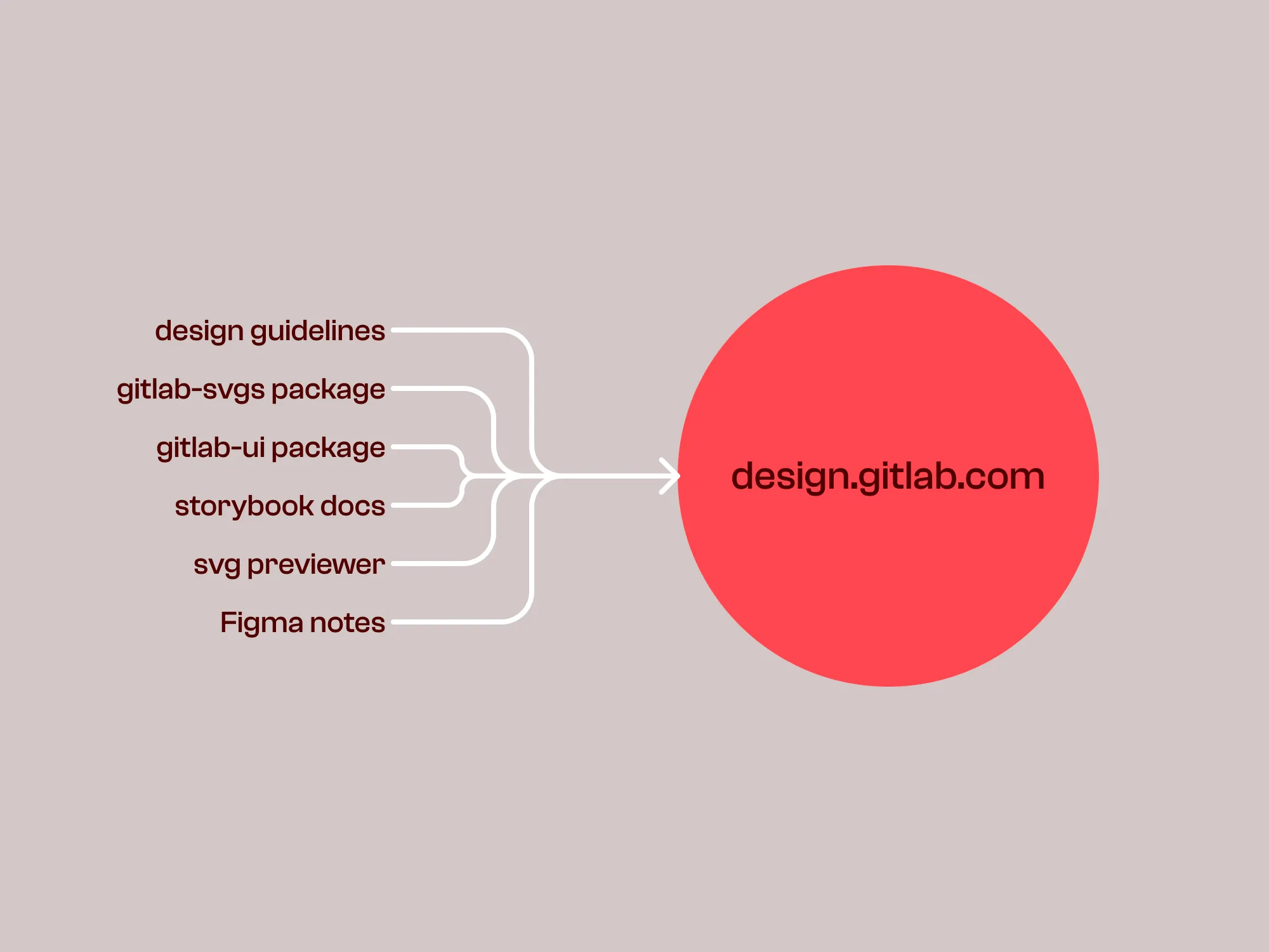
The first survey identified the cost of contradictions across the different design system surfaces. These inconsistencies caused mistakes, slowed down reviews, delayed shipping, and reduced trust in the design system. My recommendation to make design.gitlab.com a single source of truth was accepted. Acting on these insights I updated 16 component pages with coded examples, and tackled long lasting ‘todos’ building out a reusable component structure system. As a team we migrated to a monorepo and refactored documentation to be shared for both designers and engineers.

Along with celebrated gains in key metrics, trend analysis across a subsequent study identified a 22% drop in contribution ease and 15% increase in outside-system usage. This broad issue threatened design system effectiveness and quickly established a top priority for the team: rebuild trust and increase contributions through clearer processes. The findings resonated with company leadership, influencing investment to double the team size and solidifying a service model.

I partnered with product designers on new contributions, audited emerging patterns, and created a plan to address them.

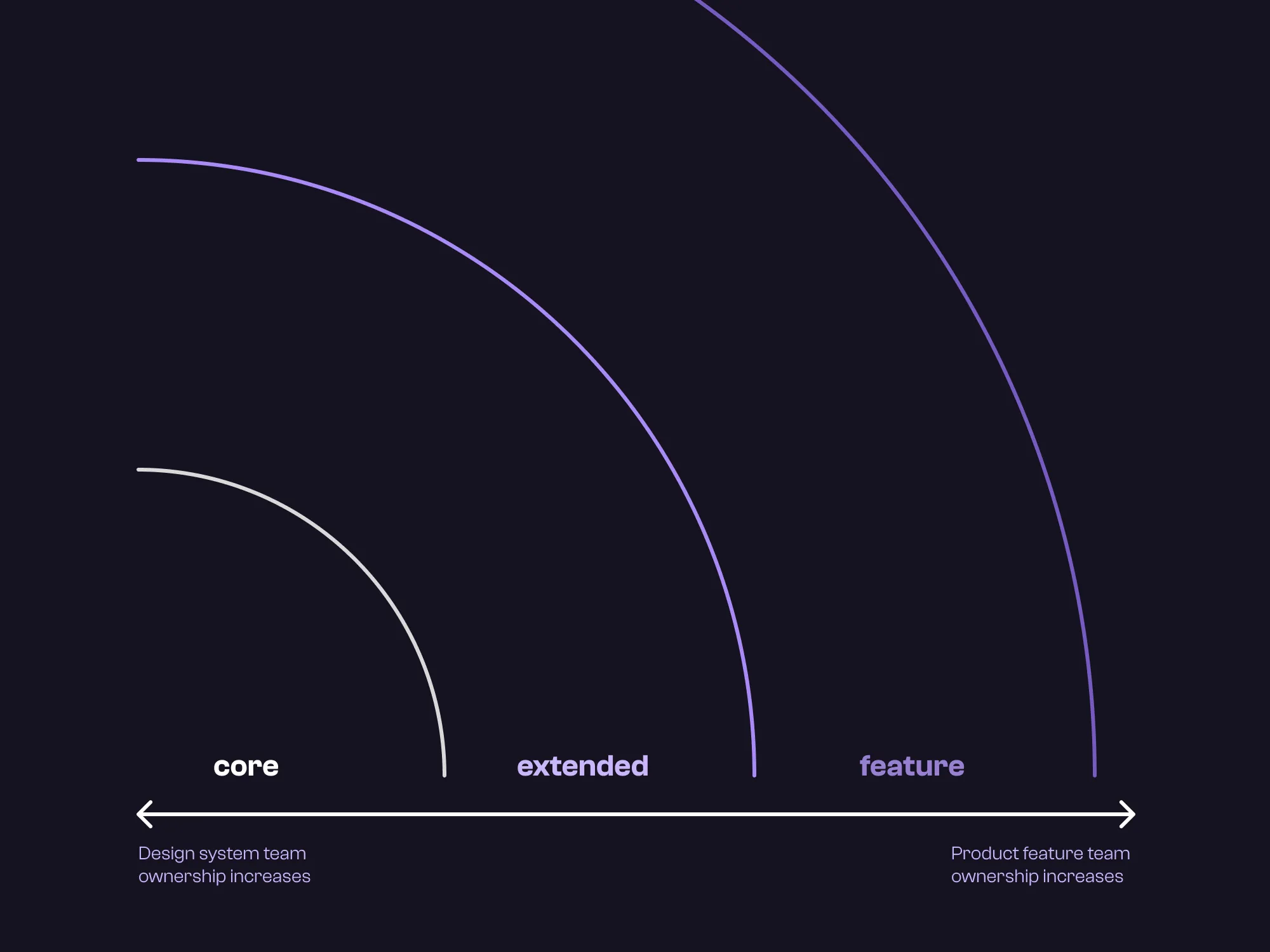
It also warranted a strategic response, I led separating “criteria” from “requirements” in a new Core/Extended layers framework, an approach that clarified how components are classified and evaluated, and contributed to shaping accessibility requirements and entry criteria for the layers.

Design tooling 1
Design tooling 2
Design tooling 3
Design tooling 4
Design tooling 5
Design tooling 6

Design tooling

Building assets and mechanisms to support designers working with Figma at enterprise scale.

I love tools. My favourite thing is how they let me take objects apart to see how they work, and fix items that are broken.

Tools make it possible to do something. To actually make things rather than just imagine them. There is an immense satisfaction in the effortlessness of skilled hands using the right tool for the right job. A tool shapes what we can do, not just how we can do it. For all the doors it opens, it forces others to close.

Figma is a tool. It shapes how teams work together, and how software looks and feels — for better and for worse.

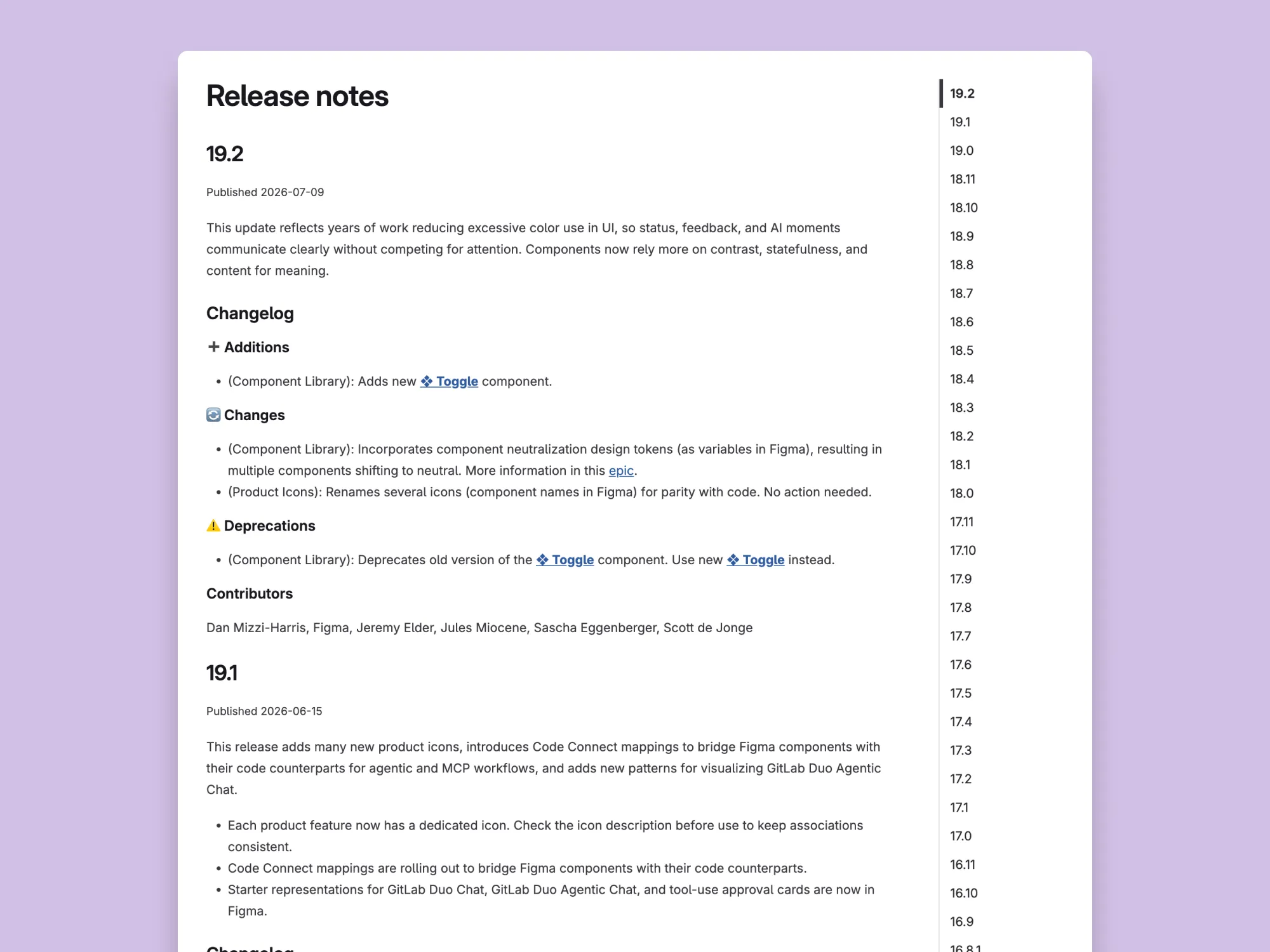
At GitLab I leveraged my design tooling expertise to create an outsize impact on teams all across GitLab.

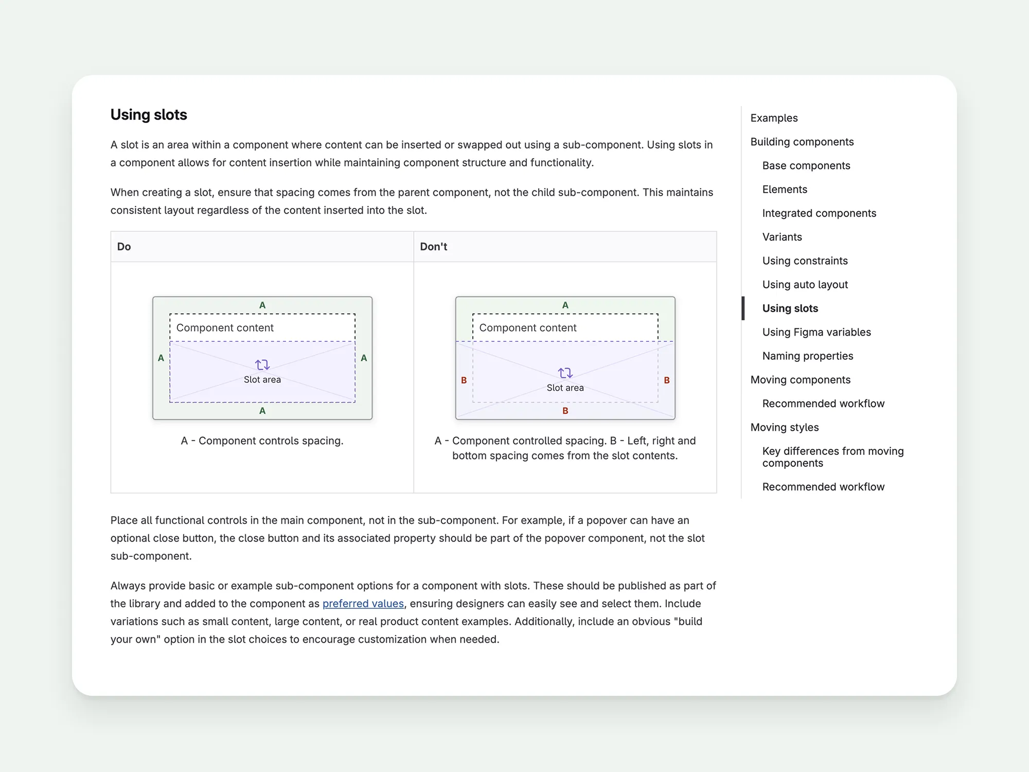
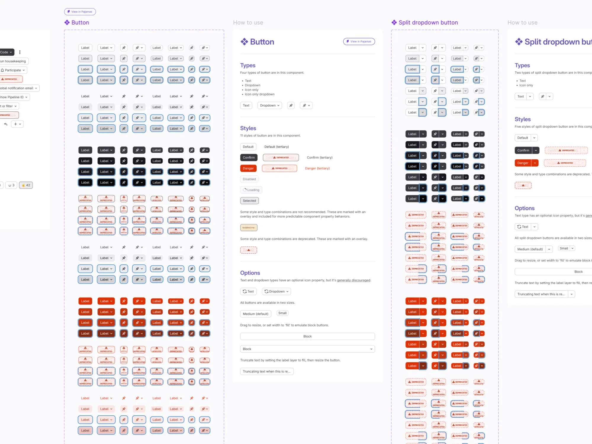
Selected highlights: Gave teams confidence to apply library updates by shaping a breaking change process; Mapped and untangled component dependencies reducing update friction across the design system; Increased awareness and dialog of library updates by establishing and promoting a consistent UI kit release cadence and communication plan; Improved complex component usability by defining a consistent slot strategy (before the native feature); Improved collaboration by migrating many hundreds of Mural boards to Figjam with no downtime or data loss by leading the strategy and implementation; Trained and mentored designers to become Figma maintainers.

Now, design tooling is changing. Canvas tools like Figma will always have a place in the design process, but its role is shifting. I’ve been exploring how AI is shaping designer workflows.

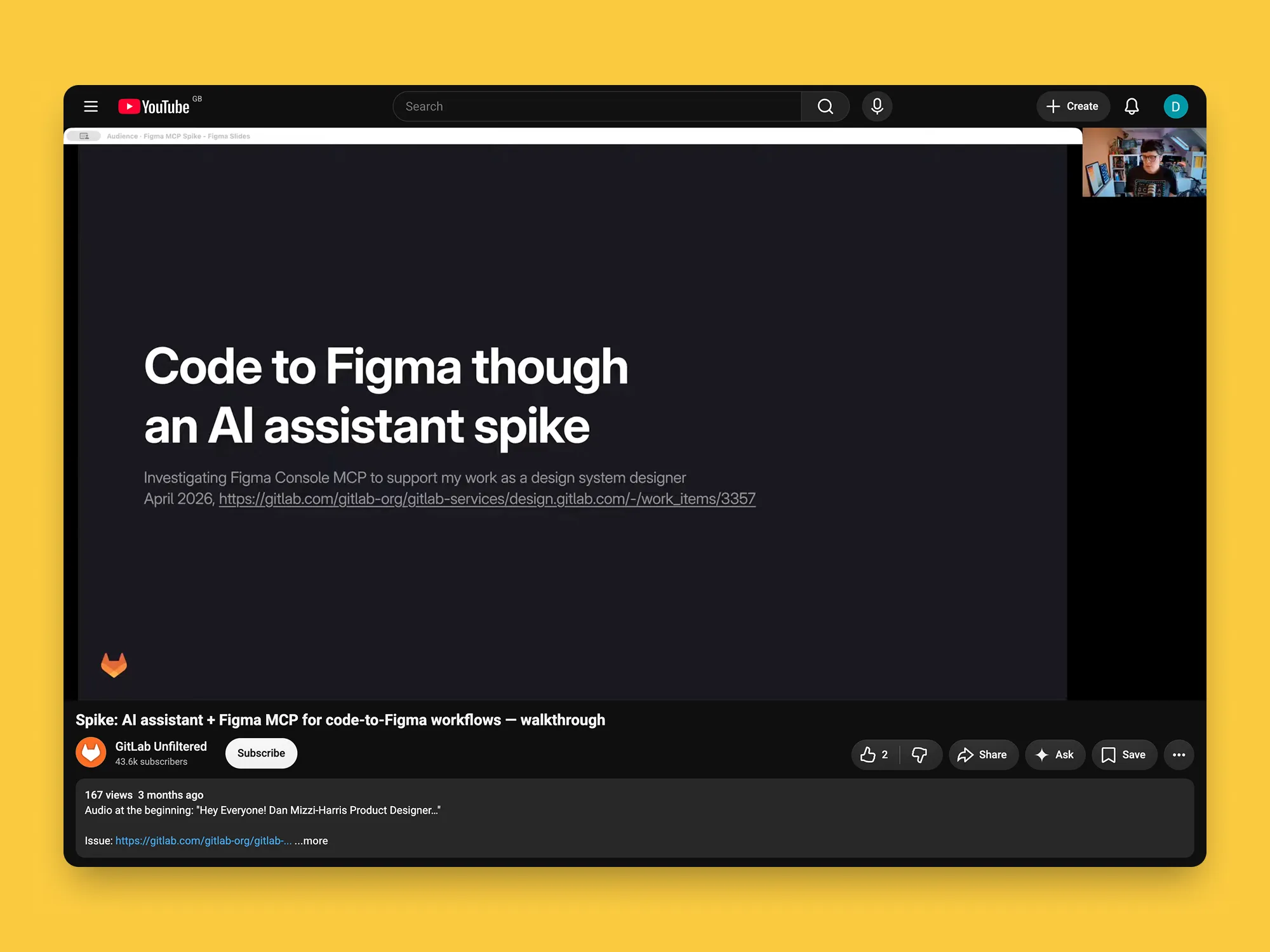
Generative AI through an MCP can be used to perform tasks in Figma. It’s unrefined, but it is cool and could become useful. I documented my findings, and created a prioritised list of recommendations to implement.

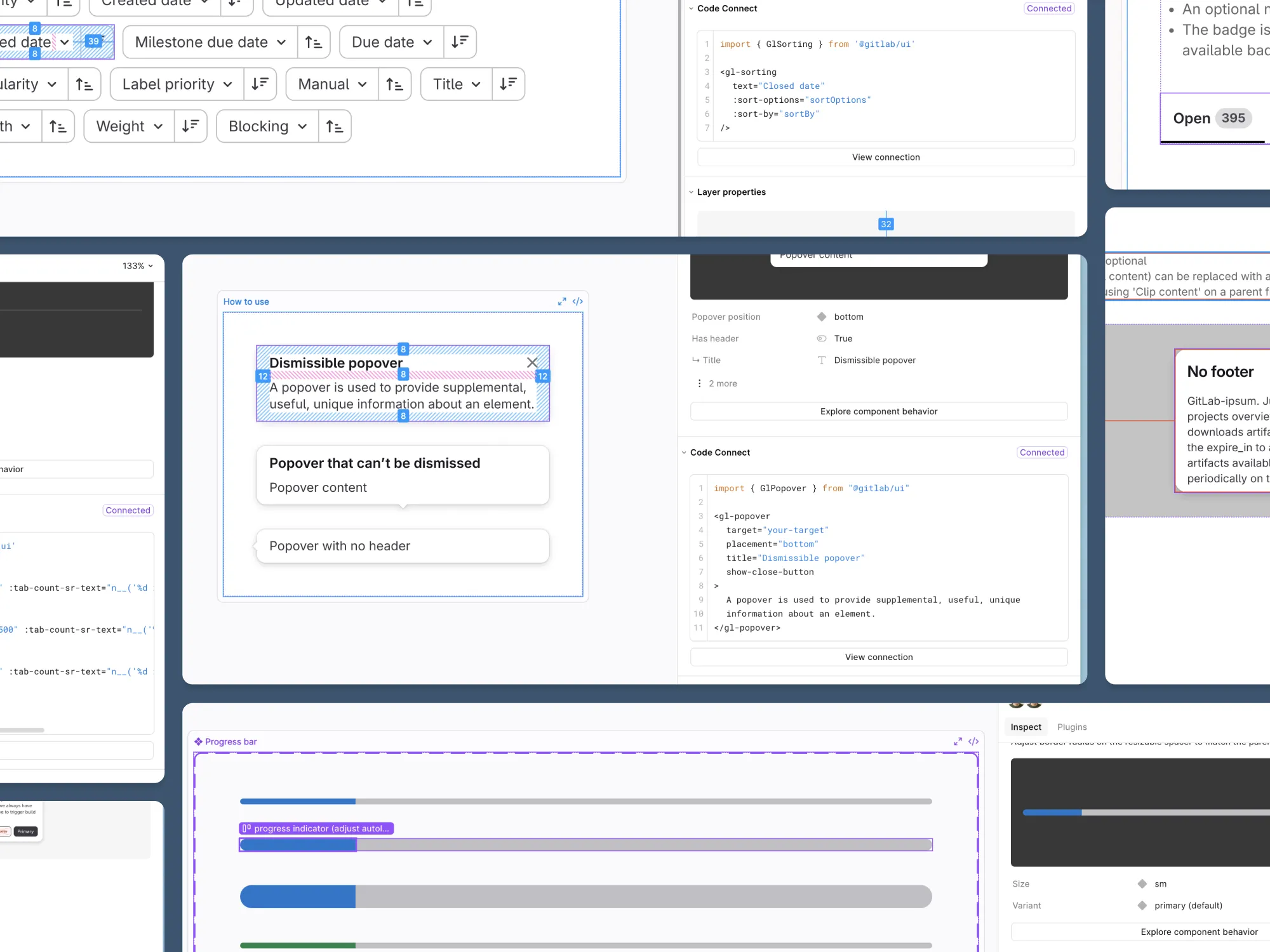
To support designers moving to code prototypes I built out a skill to use Figma Console MCP to bridge our Figma library and code through Code Connect, achieving 80% coverage, building the guardrails to enable AI to understand the design system.

The Pharmaceutical Journal 1
The Pharmaceutical Journal 2
The Pharmaceutical Journal 3
The Pharmaceutical Journal 4
The Pharmaceutical Journal 5
The Pharmaceutical Journal 6

The Pharmaceutical Journal

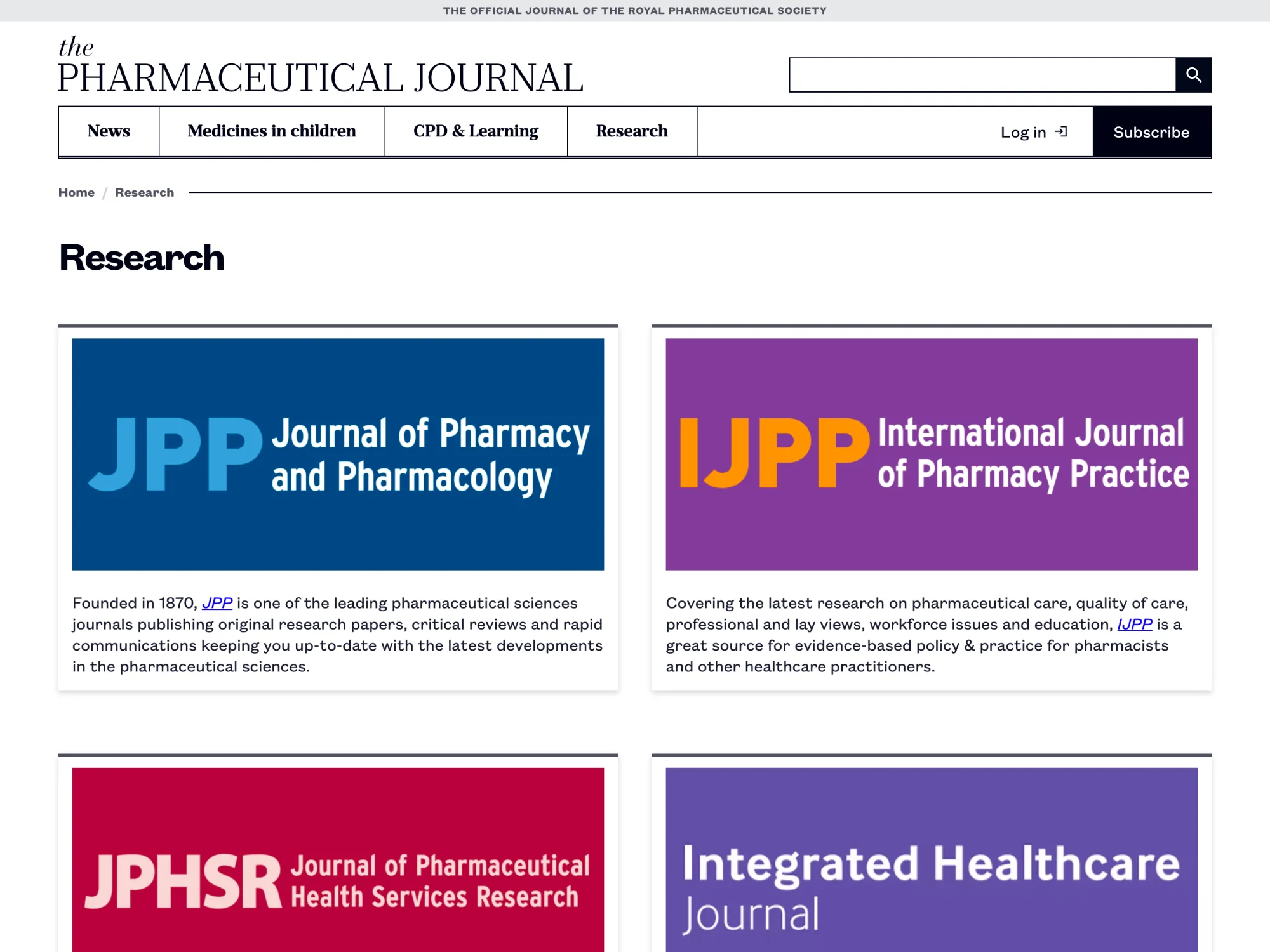
Building the editorial content system needed to bring an award-winning print publication to the browser.

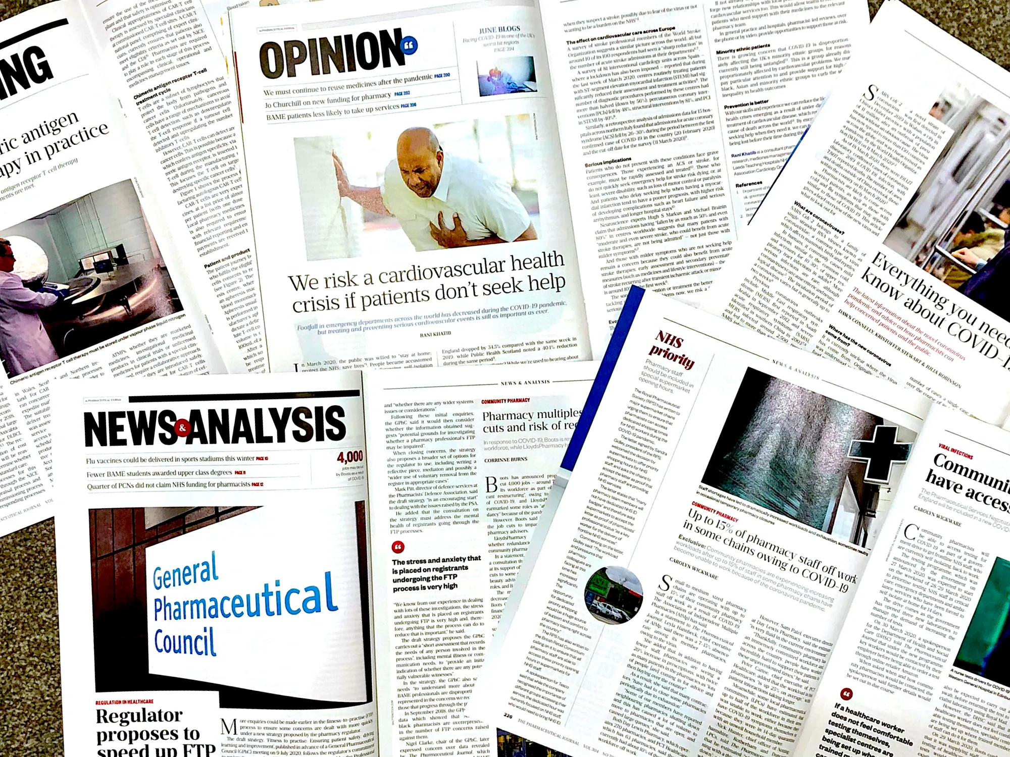
A 180-year-old publication carries a lot of content.

The PJs award winning editorial design is their delivery system for critical pharmaceutical insights. Its visual communication and editorial excellence turn dense data into an effective tool for continuous medical education and professional development.

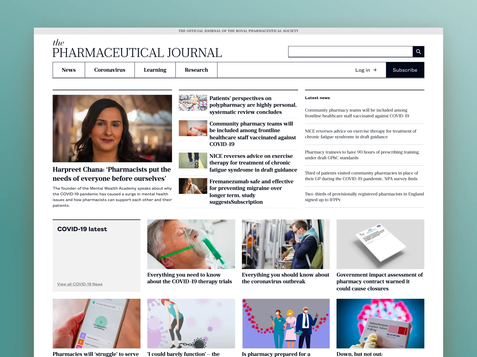
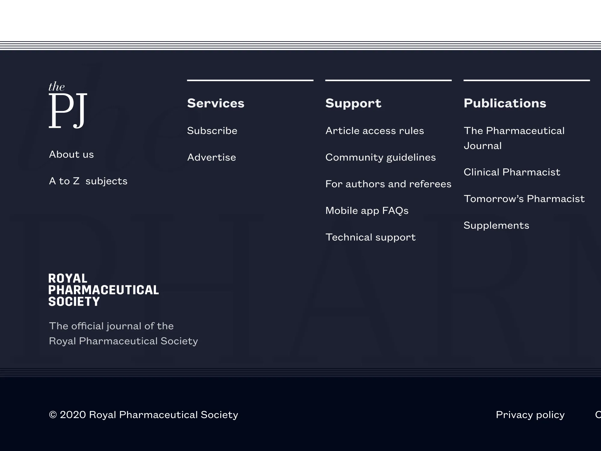
I translated their intricate print brand to the web as part of a large replatforming. Creating a familiar brand experience online, one not bound to the limitations of paper. This was not just about arranging pixels on a screen, but building a content system to carry 180 years of authority into a medium that didn’t have it yet, in the thick of the COVID-19 pandemic — no pressure.

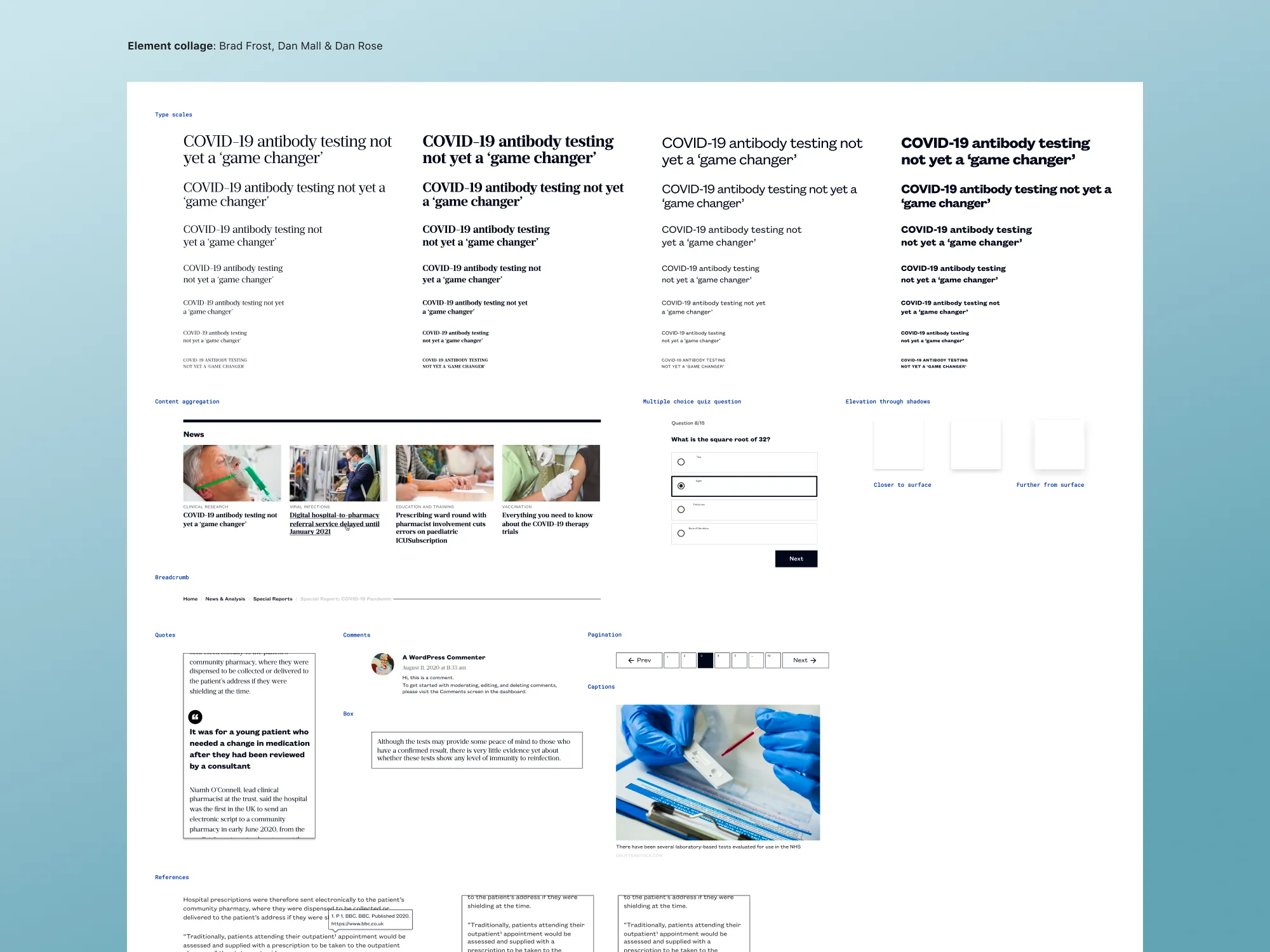
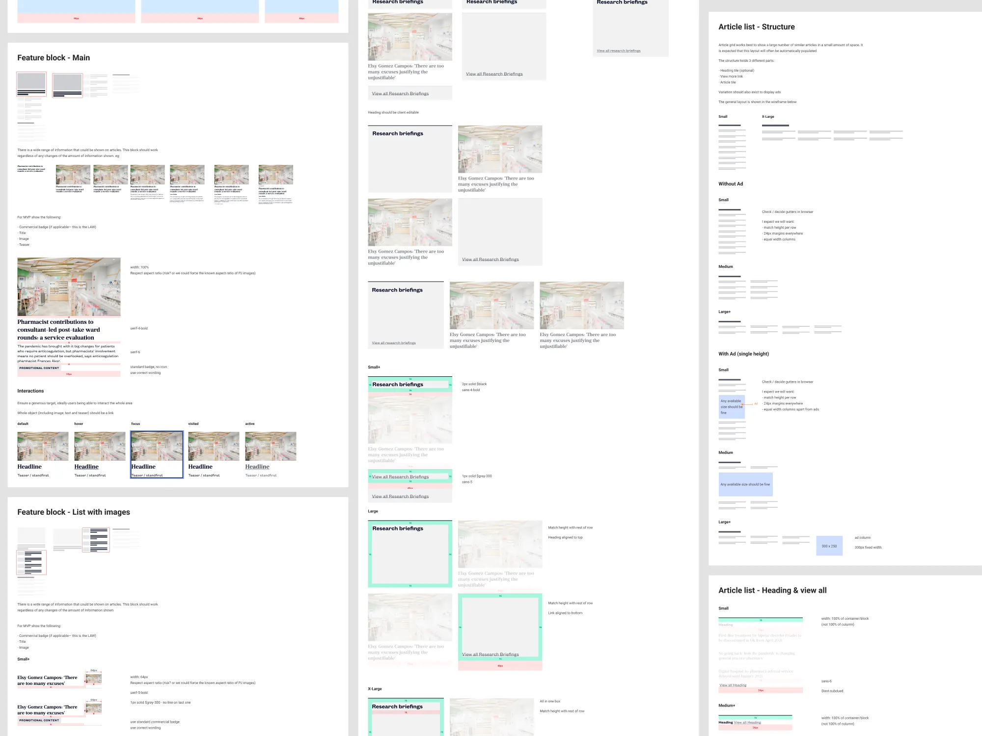
We bet on process as much as pixels to hit a challenging deadline. I guided the whole project team through the skill of critique, leaning on the lessons from Discussing Design. This kept client feedback around goals and functionality, not about how it looked. Style tiles and element collages allowed ideas to be evaluated without needing them to be fully realised.

“Slow is smooth. Smooth is fast.” And we really felt that payoff. Extra investment upfront meant research, design, engineering, and content editors could then work in parallel, united by a shared understanding, single vision, and known constraints.

We delivered a powerful editing experience built around the Gutenberg block editor. This allowed full editorial control and content curation for different member needs, without losing the editorial design members expected. Access to content was also increased with the site reaching WCAG 2.0 AA.

The new online experience launched with 10,000 articles across 6 different content types. My inputs were a design system in a very pure sense — not a handoff artifact, rather a shared language between designers, engineers, and editors.

All serving one goal: make a publication with almost 2 centuries in newsprint feel native in the browser, with a system that would outlive the launch. An online expression with all the authority of 180 years behind it.

Contact

Questions? Feedback? Ideas? I got something wrong?

Whatever it is, it would be lush to hear from you. Maybe we can revive the dead internet.

Right now, I am open to new work opportunities. If there's something that you think we should collaborate on let's chat!

hey@danmh.co.uk